
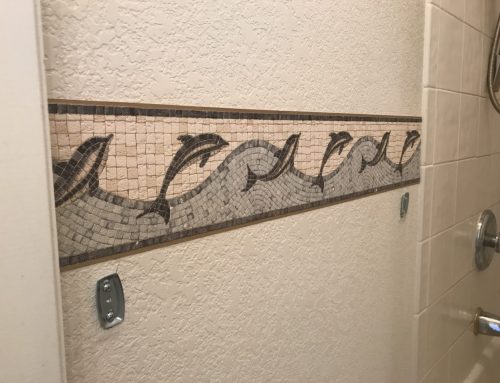
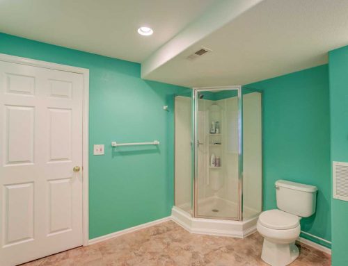
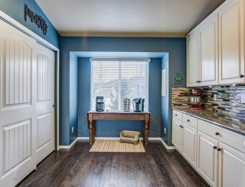
When preparing to paint a space, there is one vital factor you should take time to ponder: color. It can be difficult to find a starting point. There is a range of options and each can change the look of a room drastically. When you pick a color, you’re crafting the mood of your space; you’re crafting a feel your visitors will pick up on.
Color plays at the human psyche at a level we might not even consciously register. Color theory teaches us how to use that to our advantage. When considering what color to paint a room, color theory can be a handy tool to make an informed decision backed by an art concept and science dating back centuries.

The Basics
The first thing you should understand about color theory is something you might have picked up in your elementary school art class. Colors are grouped into three main categories: primary colors, secondary colors and tertiary colors. All of these colors are arranged in something Issac Newton mastermind in 1666, the color wheel. As simple as this may seem, understanding the color wheel and color groups is crucial in mastering color theory. Even seasoned artists stay true to their roots and reference the color wheel from time to time!
Another concept most of us are familiar with are warm colors vs. cool colors. On the warm end, we have our reds, yellows, and oranges- think sunshine. Cool colors are where our blue, purple and greens. These are more reminiscent of a rainy spring day.
Different colors along the spectrum tend to stir up their own unique emotion in whoever is viewing them. This is often referred to as color psychology. It turns out, most of us draw the same feelings when looking at the same color. Red invokes excitement, passion, and energy. That’s why it’s used in marketing so much. Purple, on the other hand, is praised for its soothing effect. Each color comes with its own feel. When we pick a paint color, this is something to keep in mind.
Choose a Color Scheme

If you’re going for a cohesive look in your space, it’s important to understand color harmony. We’ll have to revisit our color wheel to achieve this. There are three main categories to draw from: complementary colors, analogous colors and triadic colors. When you’re stuck on which colors to combine when designing your space, refer to any of these three methods of color matching. This is a surefire way to create color harmony. And just like that, you’re well on your way to a stunning color scheme.
Take Advantage of Existing Palettes
If you’re still not feeling inspired, don’t be afraid to draw from existing palettes. Dive into Pinterest. Or take some time to browse interior design websites. You have a wealth of knowledge right at your fingertips. With a simple Google search, you’re sure to rustle up some brilliant ideas.
Looking for an even more focused tool? Sherwin William’s offers a helpful app called ColorSnap Visualizer. You can use it to narrow down color choices, create a color pallete and even test colors on your walls. There are a handful of other similar apps you can use as well. If you’re looking for an interactive way to take advantage of color theory, apps might be the way to go.
Make it Your Own
At the end of the day, color theory is just a tool to help cultivate a space YOU feel good in. Whether you’re updating your home or an office space, the most important factor in picking a paint color is if you enjoy it. Use color theory as a jumping off point. After you’ve whittled down your options, pick the ones that envoke the most positive emotions in you.
Happy painting!


Leave A Comment
You must be logged in to post a comment.